Client: Miller Brewing Co.
Bringing back the High Life,
and relating to a younger audience.
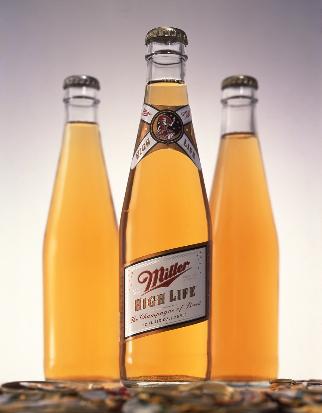
Miller High Life was once America’s most popular beer brand. “The Champagne of Bottled Beers” dominated sales and consumer loyalty as recently as the 1980s.
Unfortunately, Miller Brewing was outmaneuvered by rivals Budweiser and Coors on several key strategies and shifted marketing focus to Miller Lite and MGD, leading to a steep decline in Miller High Life’s market position. By the mid-1990s, it had become a sub-premium brand with limited distribution.
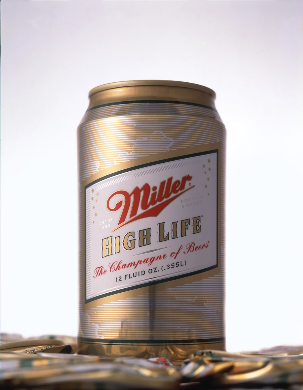
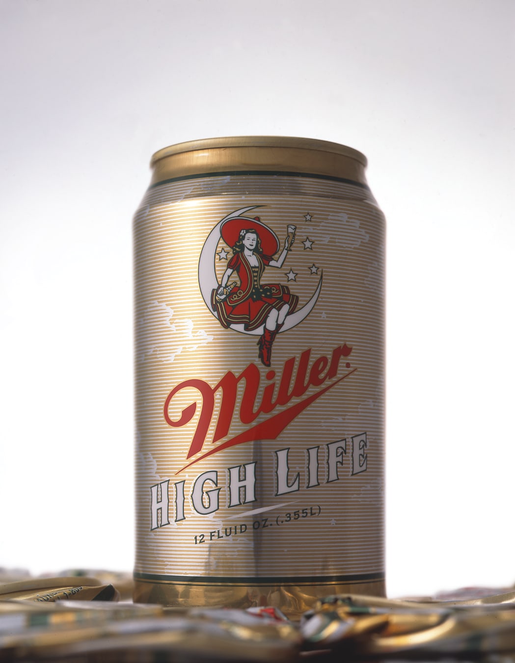
Sandstrom Partners was hired to develop a new brand architecture for Miller High Life. Our team interviewed top managers, mined Miller’s extensive archives, and studied the competitive landscape to recommend a design direction that revived heritage elements left behind. This included restoring the iconic “soft cross” label on the bottle neck, the girl on the swing icon, the rhomboid shape on the cans, the slogan “Champagne of Bottled Beers,” and the tall blonde bottle shape. These vintage elements were refreshed enough to resonate in today’s culture, giving the brand renewed energy without losing its luster.
The results were astounding. Initial sell-through far surpassed forecasts, prompting Miller Brewing to immediately allocate $50 million in advertising to support the new branding. Sales soared, premium pricing was restored, and the brand thrived again—reinforced by a Wieden & Kennedy advertising campaign that attracted millions of new consumers to the brand that had once been “my dad’s brand”.
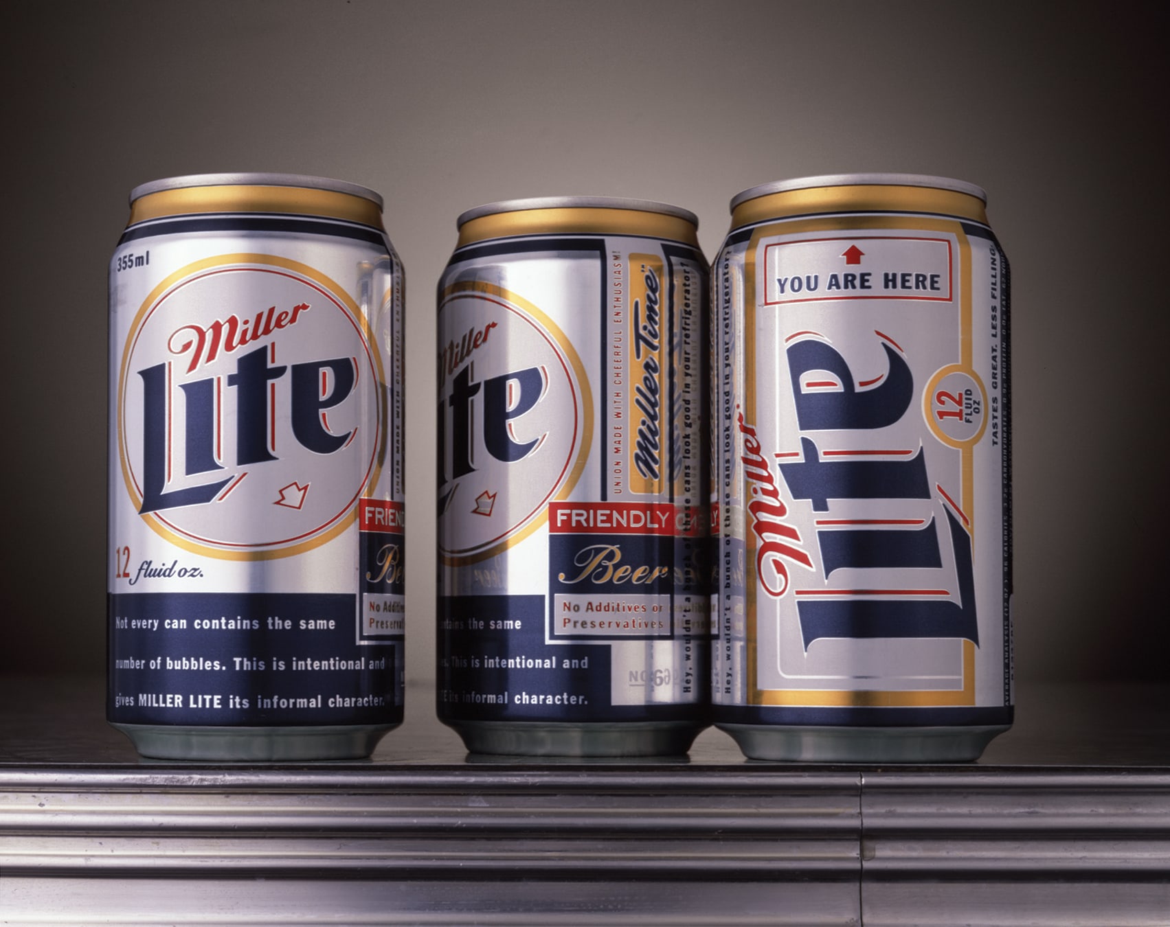
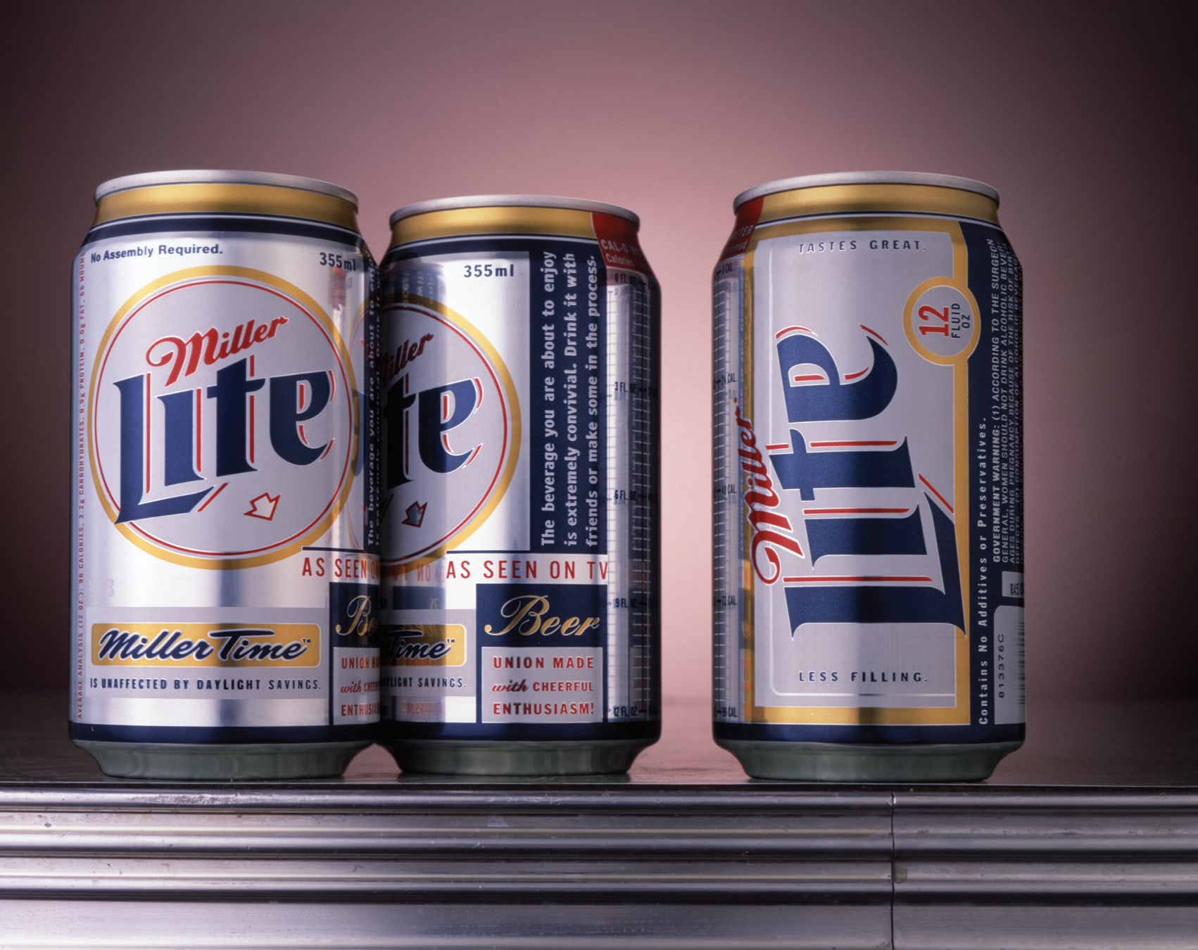
- Packaging (Miller High Life/Miller Lite)
- Identity (Miller Lite)