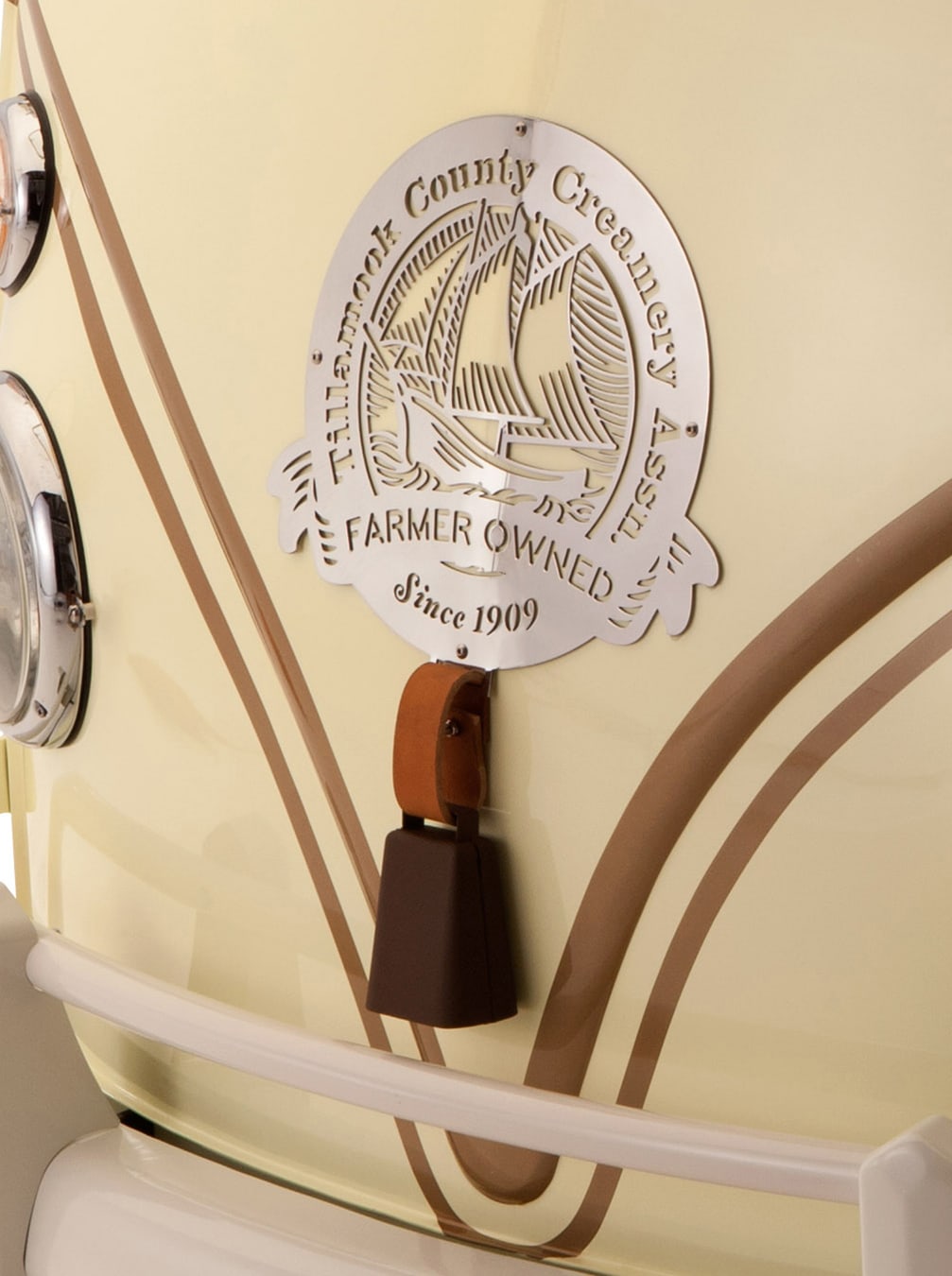
Client: Tillamook County Creamery Association
A century old farmer’s co-op
gets a respectful make-over
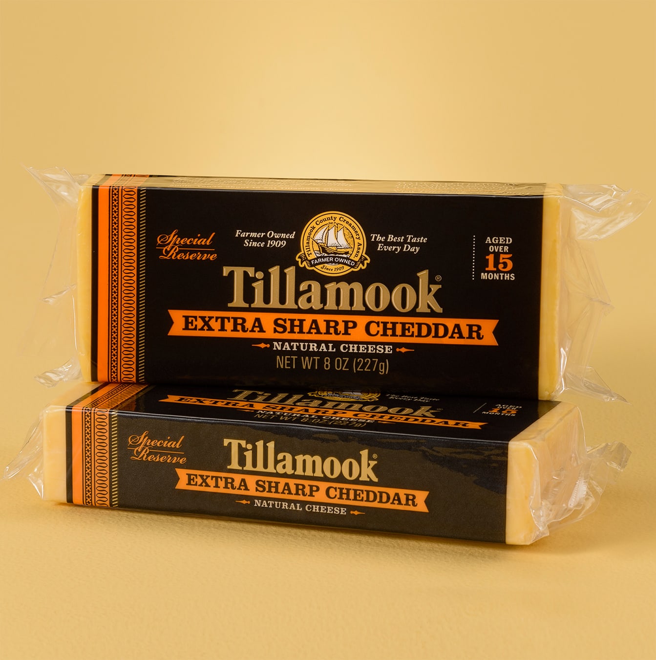
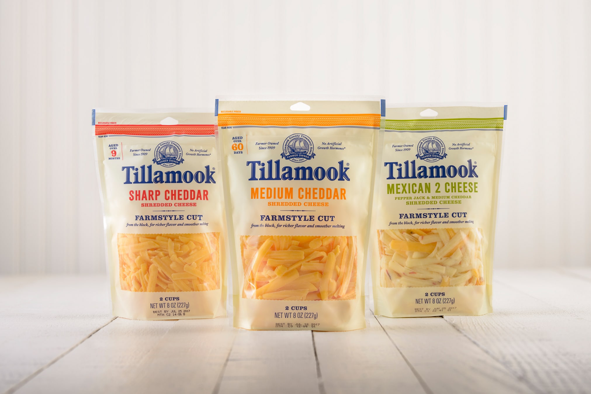
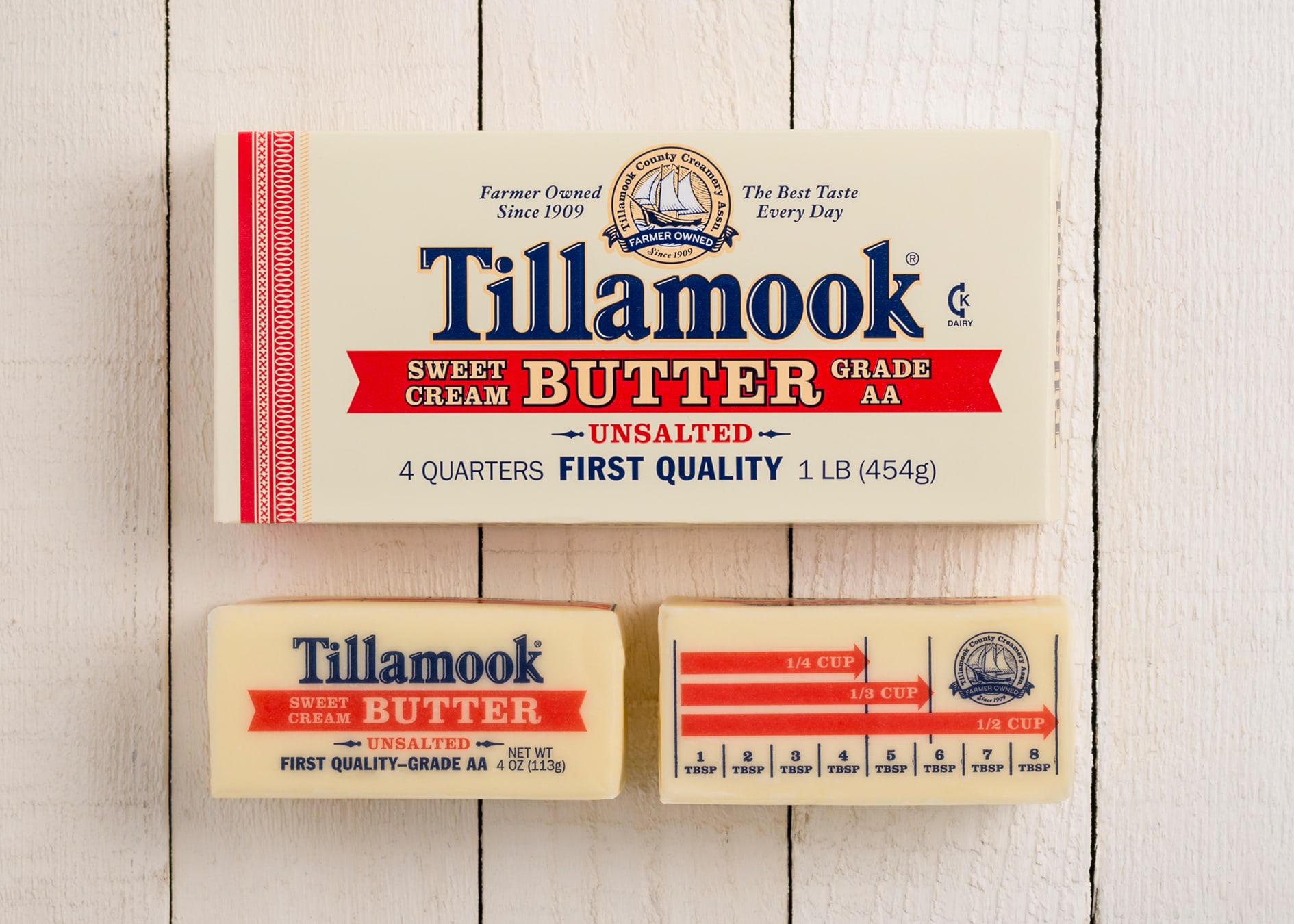
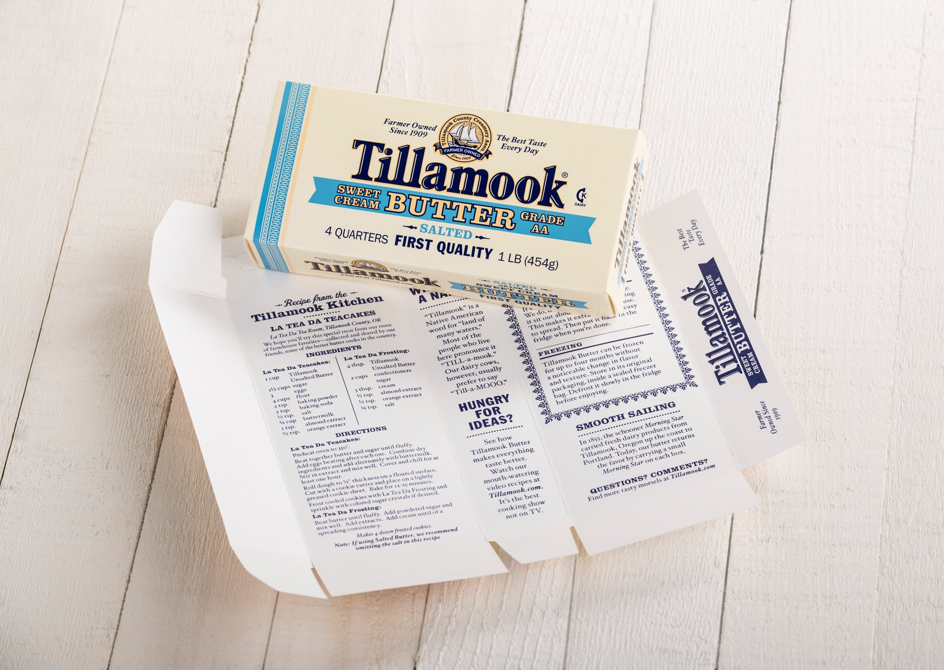
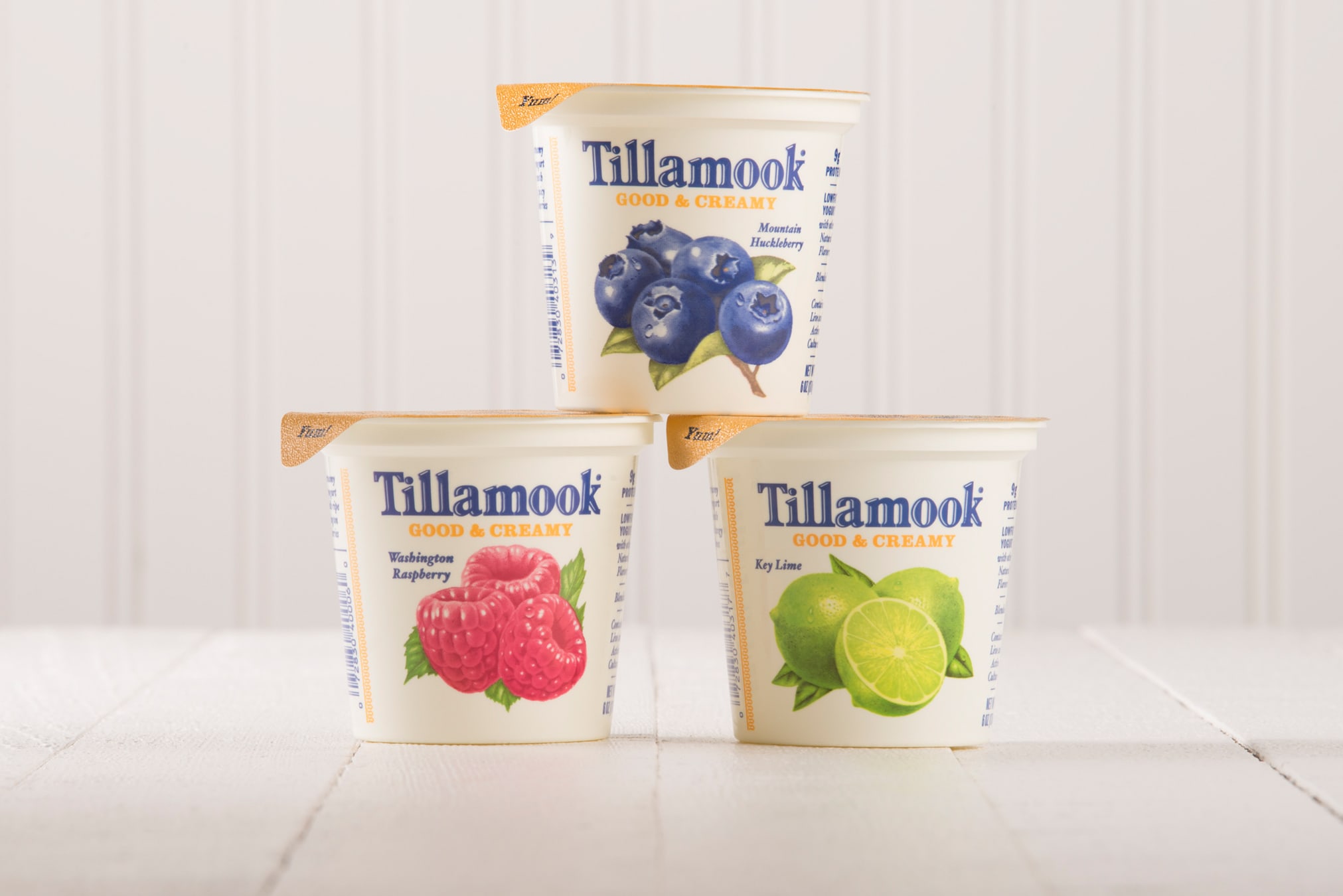
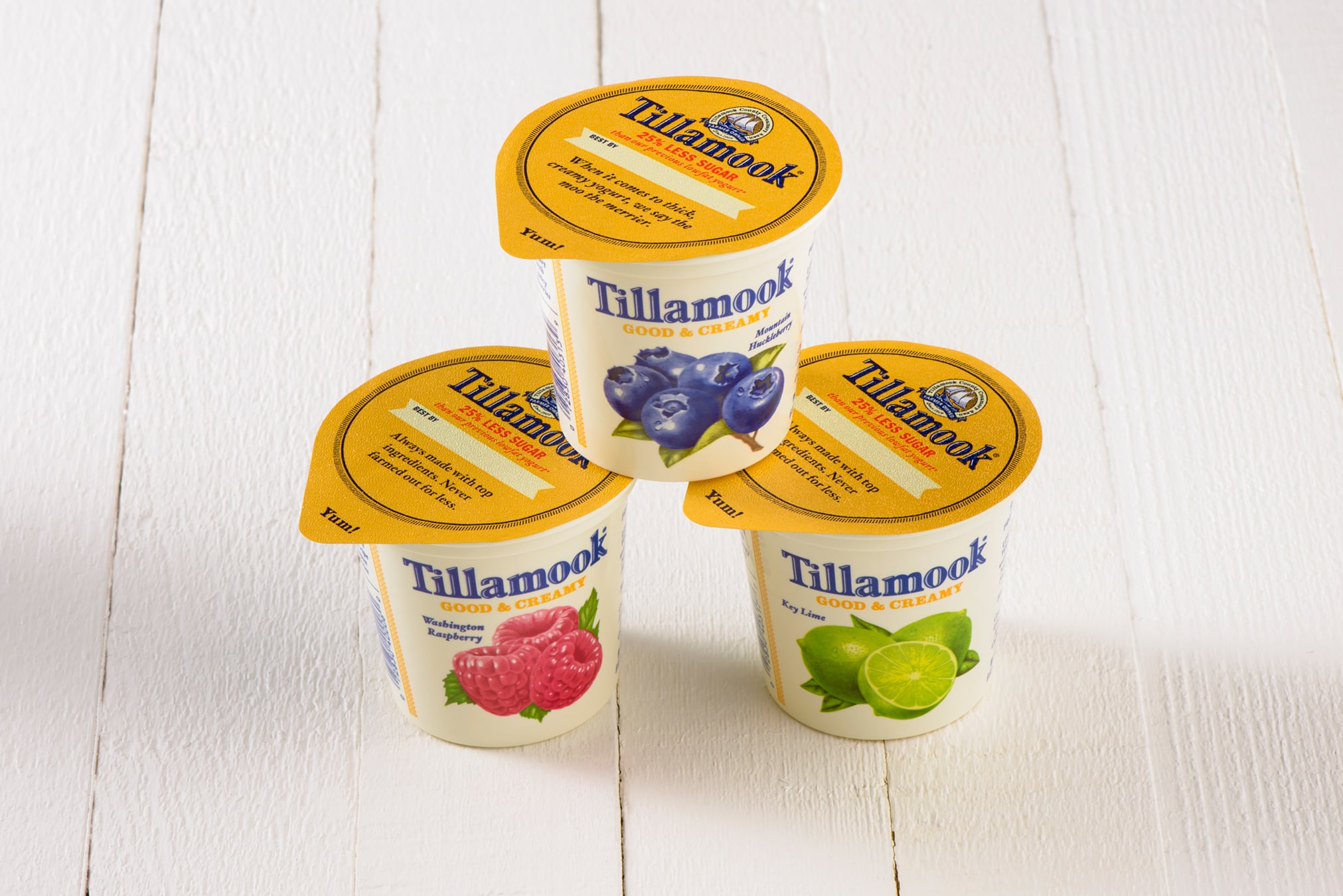
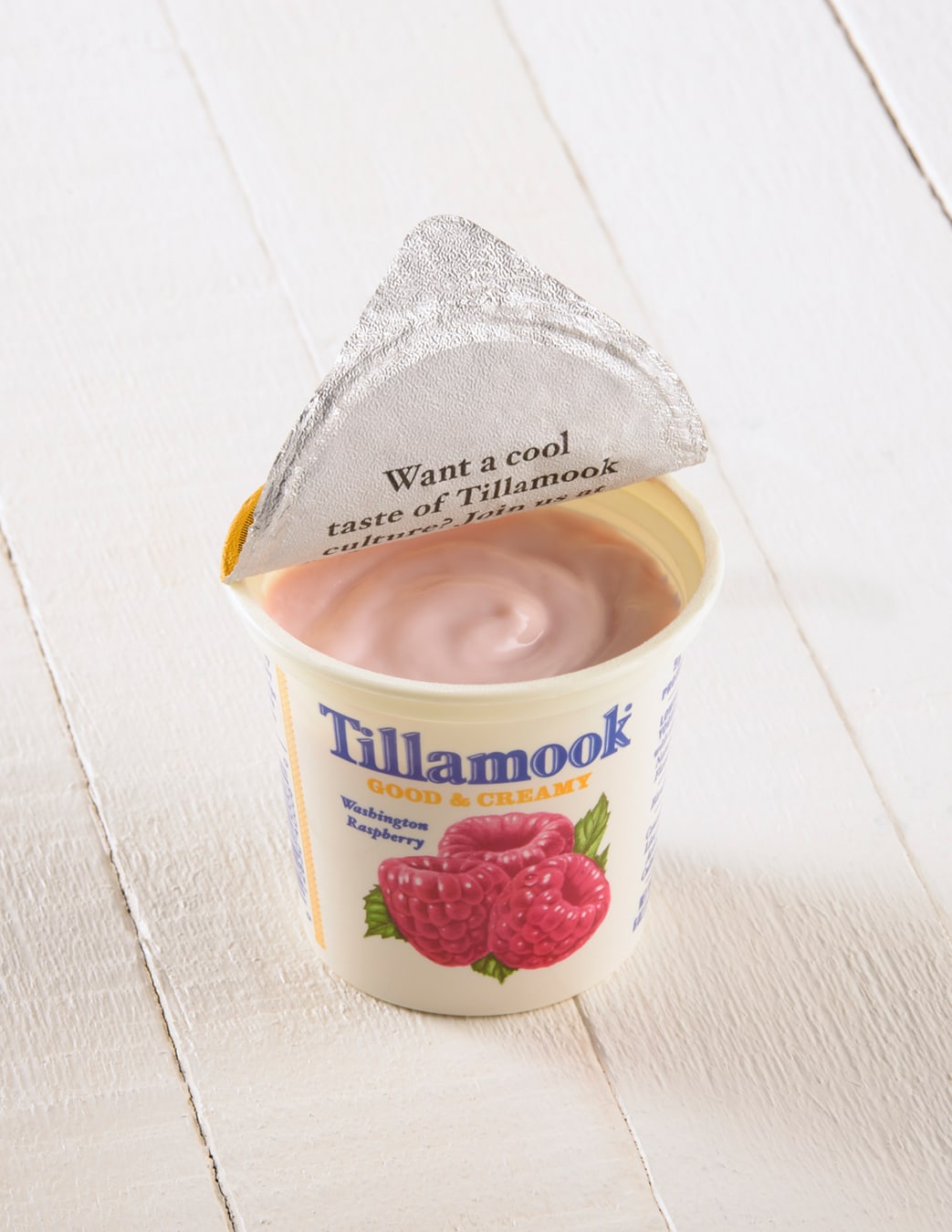
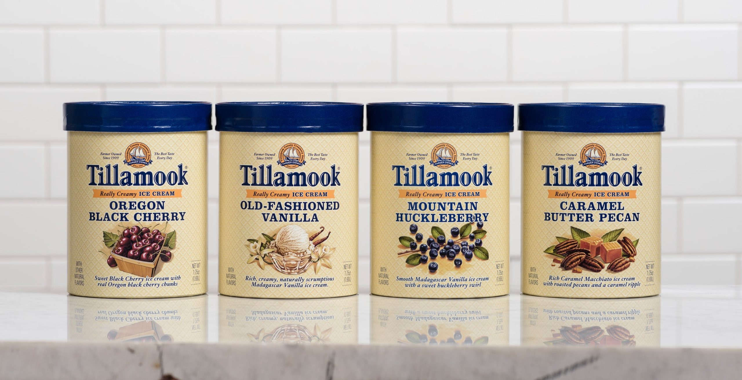
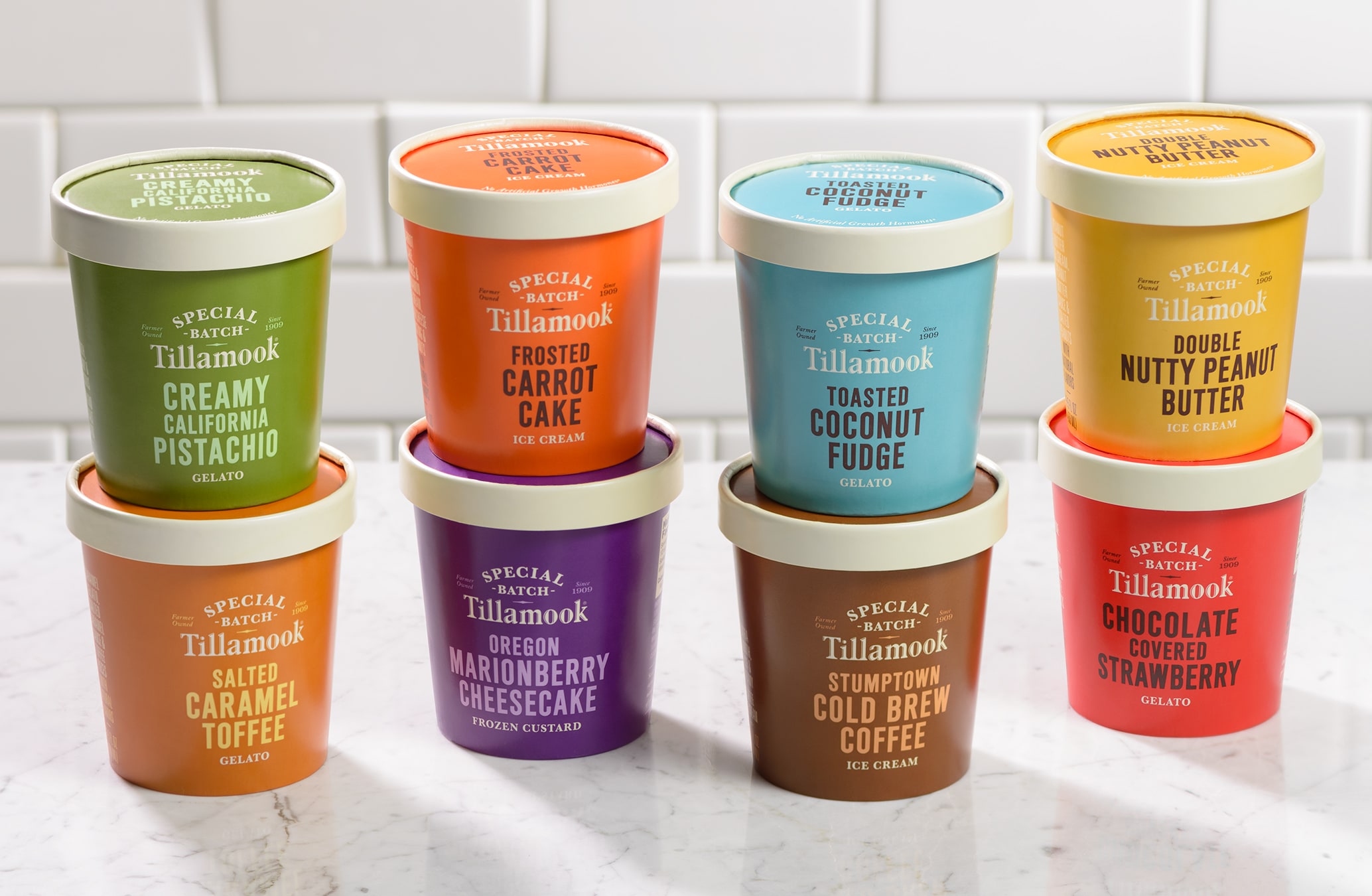
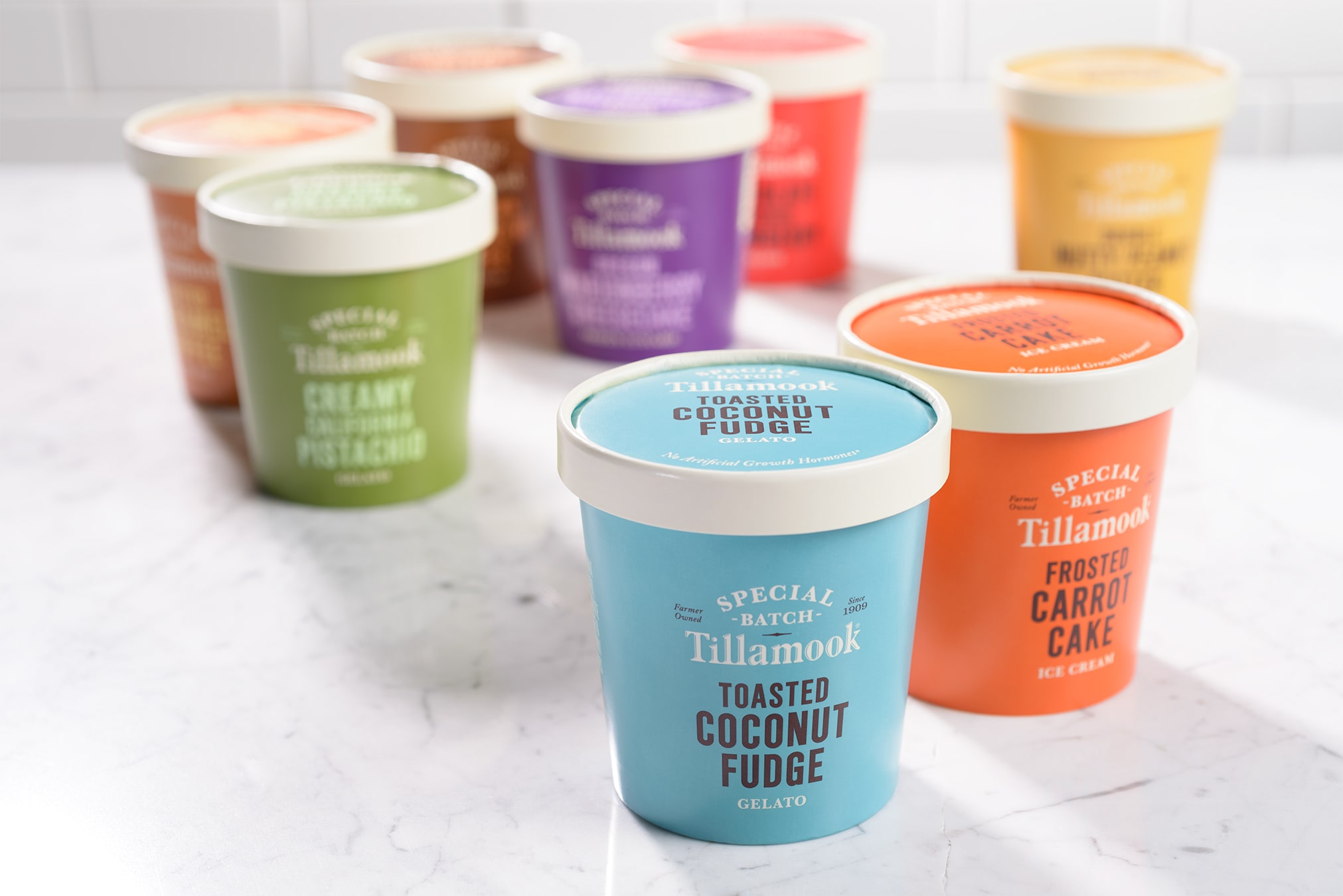
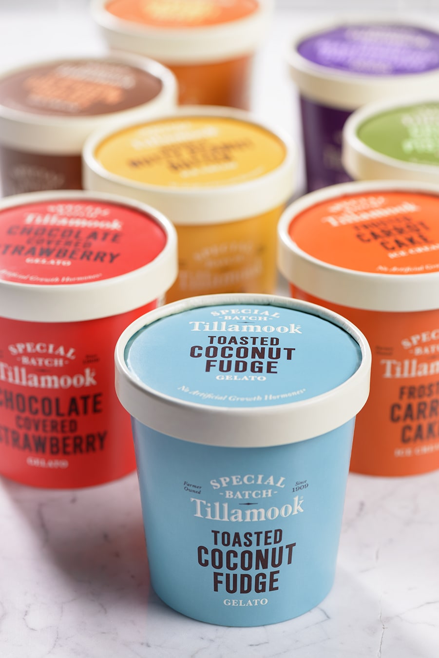
Our friends at Tillamook County Creamery Association came to us with a simple enough request: redesign the packaging for every one of their varied 200 SKUs—cheeses, ice creams, yogurts, and butter. Unify them as a family and distinguish them from every other dairy brand on retail shelves.
Consider that Tillamook is a premium-priced dairy brand positioned as an ‘every day, every meal’ product. How to create a truly world-class identity system that still feels accessible enough for every day? We found the answer in Tillamook’s “Happy” brand spirit: the key would be finding opportunities to inject a little of of Tillamook’s historic playfulness and wit into the packaging.
This was the biggest packaging effort in Tillamook’s 105-year history. Results so far have been extremely encouraging, both from a sales perspective, and from an internal stoke factor. (Yes, dairy farmers can get stoked.)
- Packaging
- Promotions